Case Study: Find Food Now
Project Introduction & Background
Find Food Now is a fictional directory of food pantries and food-related services. The responsive website and dedicated mobile app are designed to help community members reliably find free food in their neighborhoods.
The Problem: There are quite a few food bank directories out there, but few have corresponding apps or responsive mobile websites. They also often lack the service details people need. My project focuses on filling those opportunity gaps.
The Goal: For folks without desktop access, or those who rely on mobile technology, this app will provide an easy and straightforward way of locating food resources in their communities.
My role: Research, wireframing, design, prototyping, testing
Project duration: This project was worked on from February 2023 to March 2023.
User Research, User Journeys, & Ideation
User Research: I conducted a competitive audit to find issues and opportunities with competing food bank directories. I found that while many directories were expansive, most did not include clear descriptions of the services available, and many were out-of-date or not being updated regularly. I also found that users would often need to take extra steps, such as contacting the pantries, to find out if their services fit their needs. I also talked to family and friends who have had food difficulties or use/have used SNAP to get an idea of how they navigated the problem of finding free or affordable food.
I was pleased to find while conducting research on my local resources that there were many options available for folks in need. The issue is finding the right service for each user!
User Journeys & Ideation:
I created two personas based on my research, and mapped out their user journeys to get a sense of possible pain points and opportunities. My initial thoughts were that I wanted to include the option to keep the directory updated - like a “Suggest Edit” button. I also was thinking about delivery options for users who can’t line up at food pantries, and perhaps a “Saved Locations” option on the app.
A user journey map for one of the personas for the project
Ideation exercise based on user research
Wireframes for the tablet version of the responsive website, shown in Figma
Wireframes for the desktop version of the responsive website, shown in Figma
Wireframing, Prototyping, & Refining
Wireframes: The function of the app is to be a directory, so I wanted the user flow to be very simple and intuitive. The homepage lets you search straight away, or explore the map.
Prototyping: After completing my low fidelity prototypes, I conducted a moderated usability study with 5 participants, each session lasting 15-25 minutes. The study was done remotely in the US.
Usability study findings:
Redundant wording: Users couldn’t tell the difference between “grocery” and “pick-up” in the dropdown menu.
CTA button placement: some users said they would want to email instead of make a call, and intuitively would expect that button to be first.
Descriptive pages and edit options: some users wanted more descriptive service location pages, and wanted the option to suggest an edit to update information like service hours.
Screens for the dedicated mobile app, showing the layouts both before and after the usability study was conducted
Refining: For the responsive sites, some users wanted the purpose of the site to be clearer on the homepage. I added text to express the goal of the site/app. I also moved the hero image lower so that the search function is the first thing people see on the homepage.
In the usability study, all users were confused by the options for “Pick-up” and “Delivery”, and suggested that it might be redundant since most people might want to see both. I decided to nix the dropdown menu and focus instead on location. The search results will state if delivery is an option.
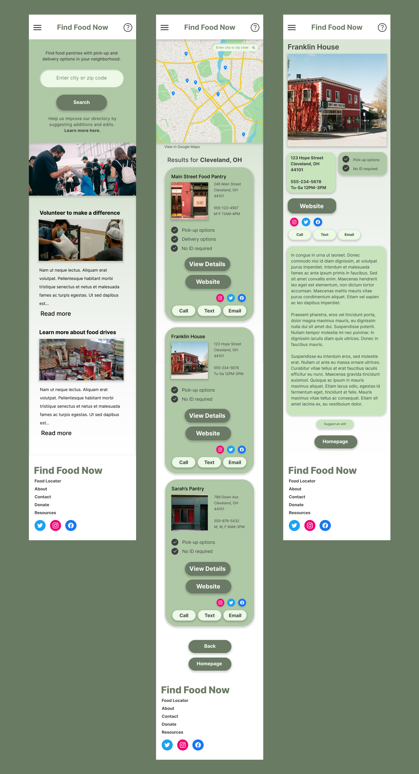
Final mockups for the mobile version of the responsive website
Final mock-up screens for the dedicated mobile app
Final Thoughts
Accessibility:
For the mobile versions, I focused on using larger and more legible types. Since the app and site are not text-heavy, this should scale easily.
Contrast was taken into consideration for the color palette and type choices. I kept the colors scaled back overall to create a friendly vibe.
The site is broken into distinct sections which would make it easy for headings and descriptions to be read by a screen reader.
Impact: Users find the design to be friendly, accessible, and easy to use. I was happy to hear that users liked that the cards told them the highlights of the food service, which was the opportunity gap I had found in my research.
What I learned: I started this project with a bunch of different ideas I wanted to incorporate, but learned through user testing and conversations with friends that I really could narrow down the scope and make the directory the main focus. I learned to scale back and focus on user needs.


