Case Study: Apartminty
Project Introduction & Background
Apartminty is a fictional responsive website for finding apartments to rent. The fresh and welcoming mood creates a comfortable browsing experience for the users, who are very stressed about finding a new place and overwhelmed by the process.
The Problem: Apartment listing websites can be overwhelming and confusing with all their options.
The Goal: Create a website that takes into account the most important features the user is looking for in an apartment, and highlight that experience from the start. Create a visual layout that isn’t visually overwhelming, and create accessible, easy-to-understand unit description pages.
My role: Research, wireframing, design, prototyping, testing
Project duration: This project was worked on from January 2023 to February 2023.
User Research & Personas
User Research: This project felt familiar and relatable, as I’ve moved apartments multiple times in the past few years. I definitely came in with my own assumptions about what a user might want or need in the process of looking for an apartment to rent, like price sensitivity and location. Keeping that in mind, I spoke with friends and family who have used websites or apps to find apartments and homes recently to get an idea of what their experiences were like, and then conducted a competitive audit.
Pain points discovered through user research:
Cards in search results: When a user searches for units based on their location or needs, they get a results page that often displays 5-10 results above the fold. The highlighted information might not be what the user is looking for, which makes it hard to know which selection to make.
Filter results: Some users find that the filters they apply don’t always seem to apply in the results, or that units are tagged incorrectly.
Misleading list price: Price ranges listed on websites usually represent the lowest to highest price per unit type, but the price listed doesn’t always represent an available unit. Some sites list the range for their entire building, which makes it hard for users to know the price of the unit they like.
I created a persona based on this research. Bao is a cane user and dog owner who needs a first-floor unit in an ADA compliant building because she has trouble using stairs. There are a few major options for finding places to rent, and they all offer slightly different experiences, but keeping my persona and user research in mind I found some opportunities for my own project.
Screen variations for the low-fidelity prototype of Apartminty (from left to right: tablet, mobile, desktop)
Sitemap, Wireframing, & Prototyping
Sitemap: I wanted the main flow to be sequential for the user: enter some items in the search field, get results, view a result, and then make a final choice (contact, tour, apply). The user can use the site navigation at any point in the journey to access “child” pages.
Information architecture for the responsive website
Paper wireframe sketching
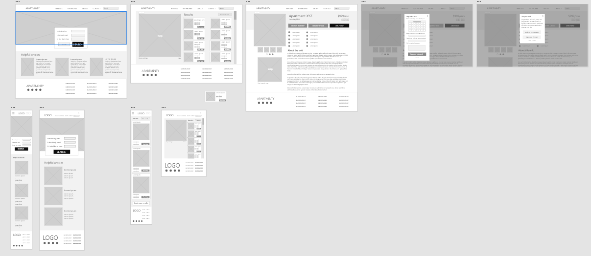
Wireframes: I knew I wanted the search prompt to be front and center, accompanied by a hero image that changes on refresh. Below it are articles from the website’s blog with helpful tips for renters. For the tablet version, I made the hero image less wide and kept the floating search box. In the mobile version, I moved the search box below the hero image, because otherwise it would be fully obstructed.
An overview of the low fidelity flow in Figma
Prototyping: After completing my low fidelity prototypes, I conducted a moderated usability study with 3 participants, each session lasting 15-25 minutes. The study was done remotely in the US.
Usability study findings:
Location should be entered: Not all users let websites use their locations automatically, so a location or ZIP code entry box should be added to the homepage.
Map is needed on the unit description page: The first prototype did not have a map on the UDP. Users wanted to see the exact location of the selected unit, as well as nearby amenities, like shops and restaurants.
Tour request options: Users liked the ability to select their preferred contact method, but they noted there was no option for a virtual tour.
Refining: I made the top navi bar smaller to allow for more room in the main body of the page. In the results page, I added unit highlights, a favorite button, and prominently displayed the unit price. I also added a calendar for picking tour dates, and drop-down menus to select a time and contact method. The request is now for both virtual and in-person tours. I also made the text a bit bigger based on user feedback.
Final Thoughts
Accessibility:
After receiving user feedback about some fonts being hard to read, spacing and sizing has been adjusted across the design to improve accessibility.
CTA buttons are easy to spot and help guide the user through the user flow.
Hierarchical type is used throughout to indicate headers and important text.
“This really does feel fresh! It’s really friendly, I like that a lot!”
Feedback from a participant in my final usability study
What I learned: I learned how to prioritize my content, and really strip down what the user needs to complete their user flow. Having to scale for smaller devices was like doing a puzzle backwards, which was challenging, but I learned a lot from that challenge.


